Vans Logo Versions Explained: Wordmark, Skateboard, More
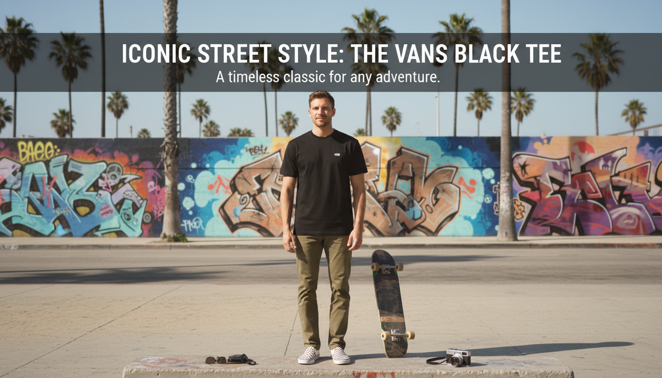
Are there different versions of the Vans logo?
Yes. Vans has used multiple logo versions over time, and you’ll still see more than one in the wild today depending on the product line, era, and where the branding appears (tongue label, heel patch, hangtag, box, or marketing).
What stays consistent across most Vans logos
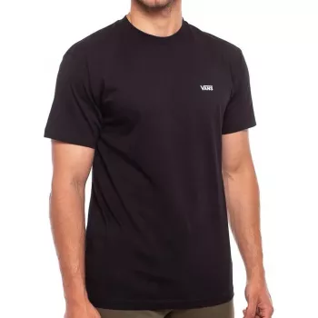
The most recognizable element is the “V” that extends like a roof over “ANS,” a design often nicknamed the “Off The Wall” style wordmark. Even when the logo is simplified, that overhanging “V” or a bold block-letter look tends to remain the brand’s visual anchor.
Common versions you’ll see
The classic wordmark: The extended “V” over the rest of the letters is the one most people associate with Vans shoes and apparel.
“Off The Wall” skateboard logo: Many products and signs use the skateboard-shaped mark with “Vans” and “Off The Wall,” especially on skate and lifestyle items.
Badge/patch variations: On some footwear (especially skate classics and reissues), branding appears as a heel patch, woven tag, or stitched label. These can feature the wordmark alone, the skateboard emblem, or a pared-down text treatment.
Vintage and special-edition treatments: Collaborations, anniversary drops, and retro collections may swap in older typography, different spacing, or alternate colorways while still reading clearly as Vans.
Why the logo can look different on real products
Placement and manufacturing matter. A tiny woven tab may simplify details, while a box print can show the full logo. Regional releases, older stock, and resale items can also reflect older branding. As long as the design elements align with known Vans marks and the overall product quality checks out, variation alone isn’t automatically a red flag.
For a closer look at notable styles and what they mean, visit https://gloriana.store/are-there-different-versions-of-the-vans-logo/.
FAQ
What does “Off The Wall” mean on Vans?
“Off The Wall” is Vans’ long-running slogan tied to skate culture and creativity. It commonly appears on the skateboard-shaped logo used on shoes, apparel, and brand signage.









Leave a comment